Tuesday 20 December 2011

Pictures continued

On the Movie Gossip page I have added a poster that I created. But first I did a rough version of the poster in photoshop just so it was easy to find colours and shapes that work instead of going through many pieces of paper at home. This draft is below.


The actual poster is below.

I decided that i would go with a black and white colour scheme because of how dark the story of Berenice is and also because it links to the way Tim Burton filmed Ed Wood and Frankenweenie when he did them.

Friday 16 December 2011

Artist Interpretations and Picture Inspirations


During the course of the work I have use many different pictures to help base my pictures of the creatures on.

Most of these picture ideas came about from me watching television programmes such as Destination Truth (Mothman, Ropen), Conversations with a Serial Killer (Belle Gunness) and Mystery Hunters (Yowie).

For some of these creatures/people I just found pictures of them that already existed and tried to copy them as best as I could. For examples, look below.

Mothman

 mothman.jpg


Ropen


Yowie

I worked with the picture of the statue of the Yowie in Australia as well as Primeval's version of the species Australopithecus, an ancient ape that could walk on two legs which was, supposedly, for the first time in history.

Bunyip

bunyip_1900.jpg 

End picture created by trying to take the fierceness of the picture on the left and mixing it with the look of the whole 'creature' in the right picture.


Belle Gunness


I already had this picture in my house so scanned it and cropped to get just the face.

Alux

For the Alux though I could not find a picture that anyone had created that looked real so I decided to use the Camobeast from series three of Primeval, mixed with elements of a baboon as my inspiration.


Josh Gates ('Destination Truth' presenter)


 I tried to copy the picture as much as possible, so much that I even went to Ogmore Castle to get the photo, I even went out and filmed an opening based on the 'Destination Truth' opening.


Saudi Blob On Beach / Globsters

                                                                               (Said to be a bloated pufferfish)
Newfoundland_Blob.jpg


(Newfoundland Blob)
(I used a picture of a Jellyfish that was taken in Scotland as it was the closest thing to a blob, or unidentifiable thing, on a beach I could find)

Thursday 1 December 2011

Friday 18 November 2011

What I Can Show On My Website

Things I can show on my website are

A top 10 of Most Haunted in Britain.
An interview with a Serial Killer (???)
Adverts for Ghost Walks/Hunts
Adverts for Newcastle's Werewolf Blood Ale (Beer)
Top Attractions in Britain.

Thursday 17 November 2011

Survey Results

Unsurprisingly my target audience would be teenagers as teenagers like to be scared with some of the top grossing movies of 2010 being films like Shutter Island, Paranormal Activity 2 and Nightmare On Elm Street. What I didn't expect was for Comedy to be the favourite genre that people watched, so maybe I could include films like 'Shaun Of The Dead' and 'Black Sheep' and other comedy horrors on the channel.


These are the results for my survey for my website.

Most of the people who answered this survey where female.

My target audience would be mainly Under 21 up to 30 years old.

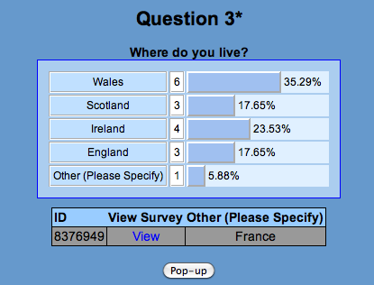
One person who answered the survey lived outside the UK.

Most people who answered this survey also enjoy listening to music.

Action and Comedy were the two top answers.

No-one who answered this survey watches News Channels but most people watch Comedy Channels

The Programming attracts 45% of the people who answered this survey to a channel.

No-one who answered this survey Never watches television.

Most people watches the television for 2-3 hours a day.

Comedy came out as the top result for favourite genre of programming.

Almost 90% of the people who answered read Magazines.

No-one reads magazines on a daily basis.

Reality magazines where the most popular answer for this question.

Interviews and Reviews tied when it came to the top result for favourite features.

Most people do not have subscriptions to magazines.

This was a follow up to the last question.

This question shows that most people buy magazines for the competitions in the magazine.

Just over 70% read newspapers.

Out of everyone who reads magazines most people only read it a 'Few times a week' and 'Once a week'.

Most people who read newspapers read them for the news.

The website with the most answers was 'Facebook'.

Most people go on websites for 'Video streaming' and 'News'.

Logo for Website

The logo for my website is below and shows the mystery side of the channel.


The bold, red lettering stands out against the smokey background and catches the eye as most of the logo is quite dark.


Films like Frankenstein and Dracula from the early 1930's helped me to decide upon the colour scheme for the logo (black,white and grey) but I wanted red in the logo because it connotes blood and danger which emphasises the horror side of the channel/website.


The smokey background helps to represent mystery and some ominous settings and this reflects the horror films of the 1930's such as Dracula with Bela Lugosi and Frankenstein with Boris Karloff, apart from the red lettering the whole advert shares the colour scheme of the horror fils at the beginning of Hollywood's life, as these horror films where in black and white. This also helps the question marks stand out as the bold, solid shapes is completely different to the wispy clouds behind them. The way they stand out make it seem that they are shadows being cast by something the cannot be seen.


 To get the cloud effect in the background I first had to select which layer I wanted them on, then I clicked on the 'Filter' tab, went down to 'Render' where another list of options appeared at the top of which was a 'Clouds' setting.


The edge of the logo has a dark banner going around it whilst the middle is much brighter, this makes it seem as if someone has shone a torch over the logo in order to make the logo visible and the edge of the logo looks like the blurry edge of a torch beam which adds to the torch idea and shows the darkness is creeping in on you no matter how you ry and escape it. Because of this torch idea, the clouds act more like a thick fog or an eerie mist as it floats in the back of the logo.

Friday 4 November 2011

Newspaper Advert Design

  Below is a picture of my newspaper ad design.

 
  This shows the main layout of my newspaper ad. Down the left hand side I have put words that correspond the stars all around the advert.

  The image at the top would have to be eye catching otherwise a reader might skip over the advert and not care about it enough to read it or even look at it. The background would be black because it would reflect the mystery of the channel and some people are scared of the dark so it would also reflect their fears. The pictures around the advert would be based on what the programming would be. The picture of a creature seeped in cryptozoology would reflect shows like 'Tales Of The Unexplained' and 'The Monster Hunter'. The criminal shot would reflect 'Inside a Murders Mind' and 'Conversations With a Serial Killer' and the eyes would reflect the mystery of 'What Lies In The Dark?'

  The logo would have to stand out on the black/dark background and this would help the catch the readers eye when they are looking at the advert, so this means the channels name, Unexplained, would have to be bold and have a different and interesting font to reflect the channel on a whole. the colour scheme would have to have mysterious and evil connotations because of the channel being based around the horror genre as well as the paranormal and the supernatural.